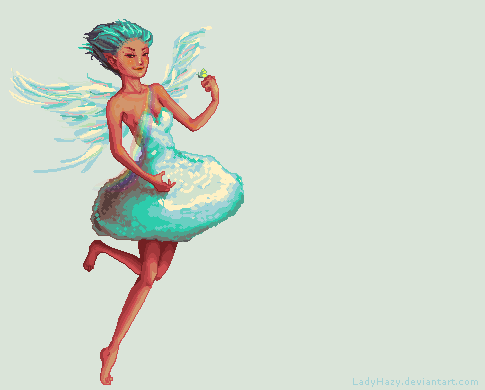
While I am not entirely happy with my entry for the 2015 Enchanted Doll contest, it does provide interesting insights to my work process. (And I say interesting because even I am continuing to discover how I start, work and finish my bigger projects.)
See, this rendering is interesting because while it is “final” in a sense that it was the one submitted, it is not yet my work process in whole. Think of it as my creative process truncated in the middle, and then hurriedly brought to completion. See, I had a sudden work-related travel schedule days before the deadline to a place where I did not have reliable internet access. I liked my concept so much that I would have been disappointed not to submit it.
But you know how you remember dreams better when you wake up in the middle of them? That is exactly what this piece is like. It may not be finished in its true sense to me, but I remember the process so well that I thought it would be worth posting here. 🙂
First notes
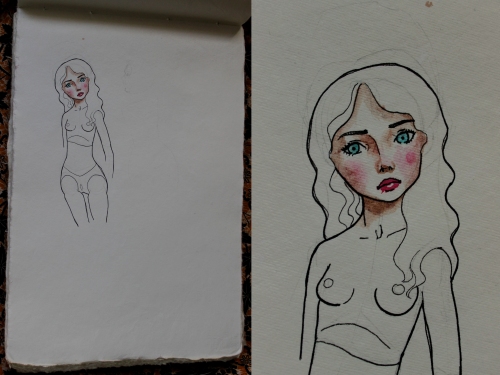
Everything I do – be it a story or a work of art – always starts with loose sketches and notes. Usually, I just jot down the first things that come to my head and, given enough time and thought, they evolve into refined plans. Truthfully, many crazy concepts come into my head that never reach fruition because either a.) I never get the chance to record them and write them down; or b.) I lack the skills the make them work.
Here are my very first concept sketches:
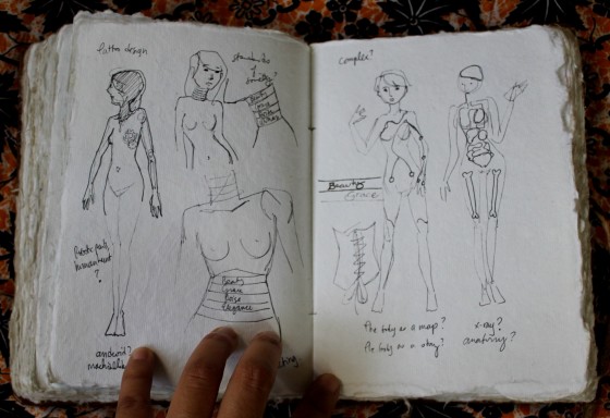
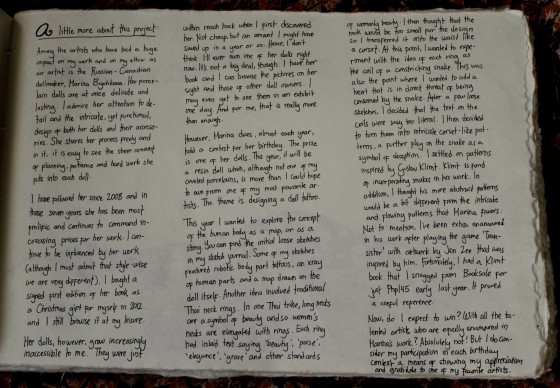
My first idea was to explore the human body as a story. (The sketches on the right page are the first ones.) I wanted to draw a “map” of the human body – a literal geographic map about an un-literal place. With names such as “generosity” inscribed on the hands, or “passion” at the heart.
That didn’t quite work out, so I tried exploring the idea of a literal map of anatomy. That didn’t work so much either.
Next, I wanted to explore the story of the doll as a machine. That is since EDs are crafted painstakingly to look human – what if the tattoo would make it more glaringly like the piece of engineering that it is.
My last idea, which is obviously what I went with, were binding neck rings such as those of the Kayan Lahwi inscribed with calligraphy of feminine ideals like beauty, elegance and poise. I then decided that the neck space might not be enough for the lettering, so I settled on corset rings instead.
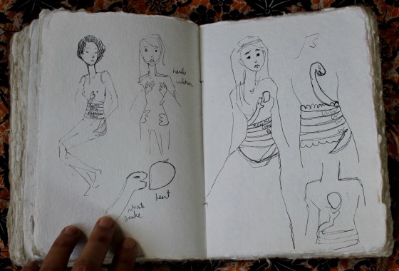
I played with this idea for a bit (although I did have a side-concept of tattooing hands symbolizing violation as well). It materialized into the coils of a snake as the corset rings. To symbolize beauty’s restricting and soul-eating standards, one of the ideas had the snake attacking her heart.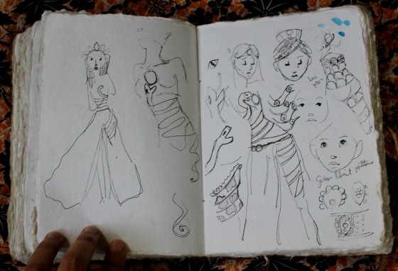
Eventually, I decided that writing words on the coils was way too literal. Hence, I settled on making the snake corset as beautiful as possible, representing beauty itself. Initially, I wanted soft, lace-like patterns.
But these eventually materialized into the patterns inspired by the work of Gustav Klimt. I have been interested in Klimt’s work for a long time, and even have a book of his works. But what made me even more enamored in his work was when Jen Zee incorporated his patterns into the science fiction indie game, Transistor. I found it brilliant. I had never thought of depicting semiconductors as Klimt-ish patterns. And ever since I finished the game, I’ve been obsessed with eccentric patterns.
The concept
Sketches are interesting, but they’re not really very pretty. They do, however, lead to my concept note. These are usually fully rendered watercolors that further explore the concept just before the final rendering.
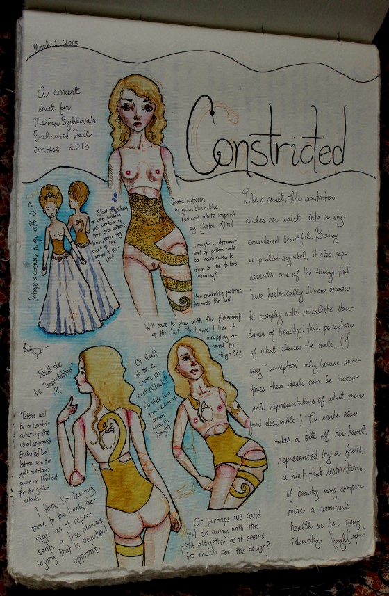
Aha! Those look familiar, you say. This is what I meant when I said that my process was truncated. Had I not had to do so much work or had enough time to spend on my entry, those images would not have appeared on my final entry. I would have completely redrawn them into a polished piece.
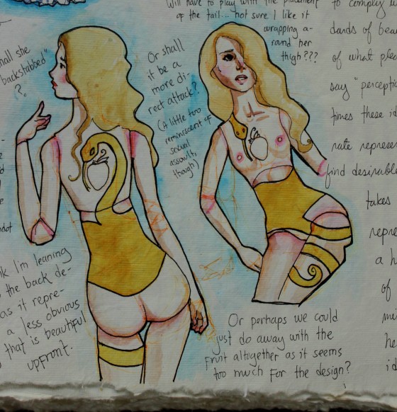
The concept still included the heart as a fruit (a reference to Eve, I guess?), but eventually did away with it as it made the design look too “busy”. I was also trying to decide whether to put the snake’s head in front or at the back. I decided that the back was more appropriate: the front could showcase the tattoo’s sheer beauty while the back, its treachery.
But please take a few minutes with me to appreciate just what a beautiful color M. Graham’s Nickel Quinacridone Gold is. Seriusly, look at how a color that should be, by all means, flat looks… well, golden. I think I’m in love.
The details
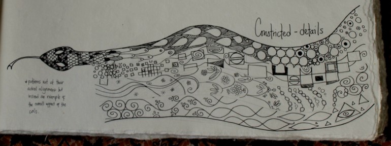
After finishing the concept, I generally sketch out the details so I don’t get “lost” while making the final piece.
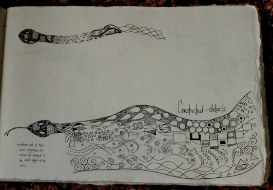
Here are the unfinished snake details. Had I more time, I would have continued the black inking, added gold watercolor paint and white gouache.
Notes to the future
Another thing I like to do is write notes for my future self. I’m a forgetful person, so stumbling upon my old notes is always super fascinating. It makes me go, “who is this person that I barely know?” And so I’ve taken to write down my thoughts about the project, just so the future me has a record of them. Think of it as my pensieve. 🙂
The final piece?
And then I got busy… really busy at work! Since this is the job that feeds and clothes me and allows me to buy all the art materials to fuel my addiction, I had to put it first.
I was all set to do the final rendering when I realized that my sudden travel schedule would not allow me to finish and submit it before I leave. Sadly, you can’t have everything in this world and so I worked with what I had as we neared the deadline.
Improvising
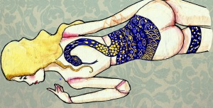
The most realistic way to finish, I decided, was to take the images I already had and then take it to Photoshop to clean it up and to add the details on the snake.
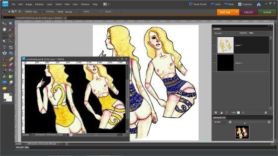
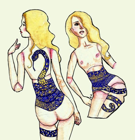
As you can see, I decided on the two images where I was torn between putting the snake in front or at the back. The bigger image on top was actually more detailed in itself, but I chose these just because I liked the poses.
I noticed that Marina uses either a blue or red color for her dolls’ tattoos in combination with white. I selected the blue because I decided that this would contrast better with the planned gold overlays.
I painted a layer over the snake in an approximation of that royal blue color, then added the gold overlays by erasing the blue to reveal the gorgeous gold watercolor paint underneath.
Et voila!

I then emailed this file to Chad and Marina, with a very short sleep-deprived description. 😛
Last Notes
Of course, if I had more time, the entry would have been totally polished and then I might even delusion myself into thinking that I have a chance to win.
As it is, though, it shall forever remain in its sketch-like state. I do love it as it is, despite its flaws.
If I could do things differently, though, I would remove or edit the coils around her leg. Since it appears at a leg joint, it’s going to be difficult for the design to appear properly at different positions. I would also add further detail to the tattoo.
—
Overall, I just loved working on this piece! It’s always a pleasure to make something for one of my favorite artists, who has such a profound influence in my own work. All the beautiful entries are view-able at the Enchanted Doll 2015 Contest Page. Mine is No. 119.
The Top 20 entries will be announced shortly. I already have a shortlist of my own personal favorites! Mind you, I know I probably shouldn’t expect to win anything at all, but I am super excited nonetheless!
—
Edit: The Top 20 is up! My entry didn’t make it, but some of my favorites did! But my personal top 3 is No. 103 (you already know I’m partial to anatomical art), No. 217 (that beautiful rendering and the costume that comes with it is simply divine), and No. 249 (the hands concept touched my mind briefly during my process, but I never imagined it could come with such a beautiful story).